Unfold Silk
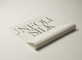
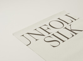
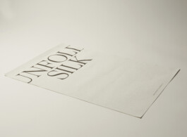
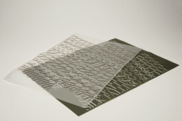
In the Kokoon Flagship Store I drew upon graphic design to communicate the narrative of the interior. Graphic posters became a part of the narrative of the store. The paper has a grainy and tactile surface. The posters form a typographic image using the typography GT Super Display in a lightweight version. It is classic and light with long, opulent serifs. It is a luxurious typography for a luxurious brand. The word silk is repeated as an easily recognizable narrative through the poster.
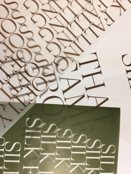
The second part of the graphic design for Kokoon is the tissue paper. It is using the same font as the posters, and is to be used when wrapping the bought product, to take a piece of the concept home. The design is visually louder than the poster design for that same reason.